The Emotional Journey of Color in Painting


The Power of Color in Art
Color has always played a significant role in art, capable of evoking powerful emotions and memories. Artists have long understood this, using color to convey feelings, set moods, and tell stories. The emotional journey of color in painting is a fascinating exploration of how different hues can impact both the creator and the viewer.
From the vibrant reds of passion to the calming blues of serenity, each color carries its own emotional weight. Understanding this can enhance both the creation and appreciation of art, providing a deeper connection between the artist and the audience.
The Psychology of Color
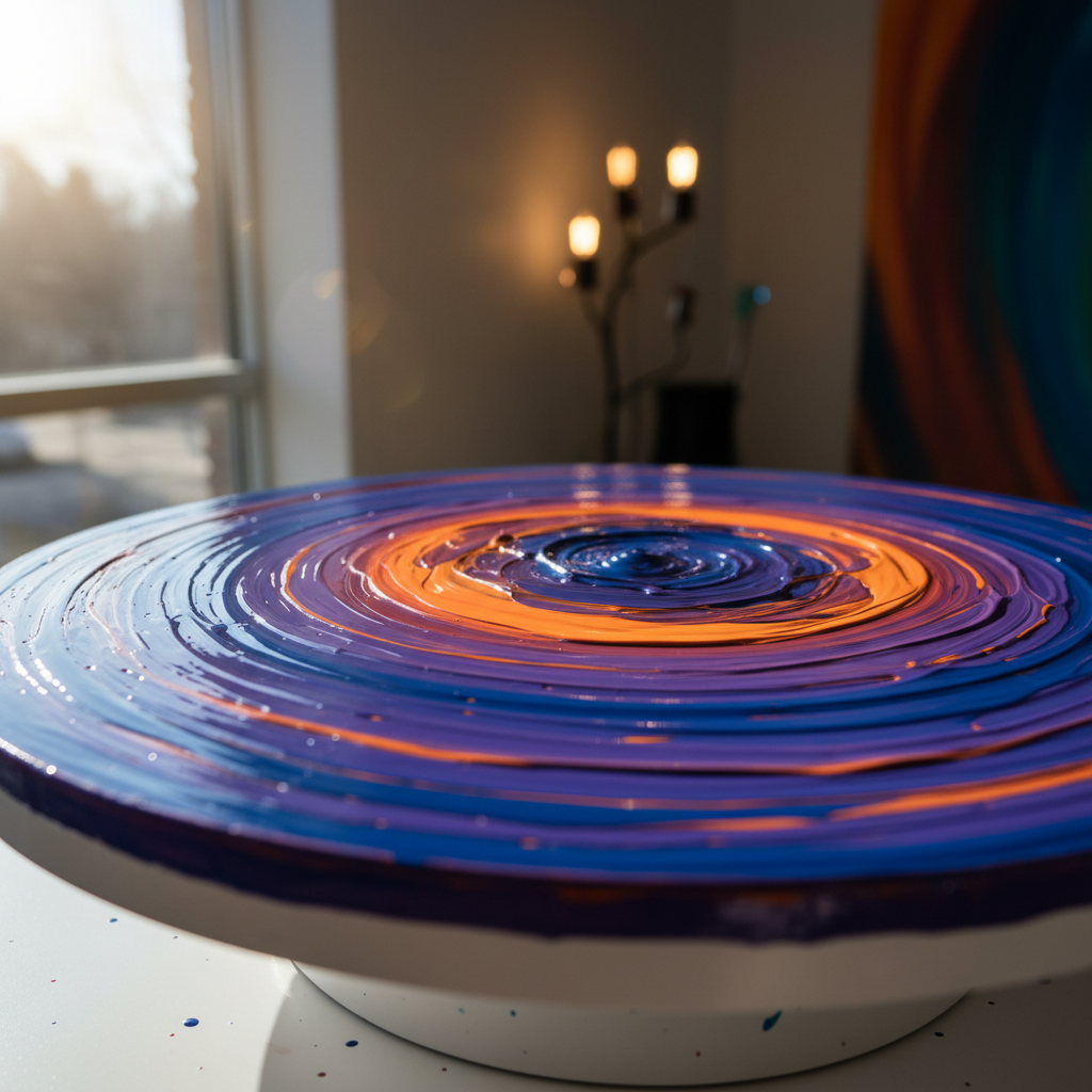
Color psychology studies how different hues affect human behavior and emotions. For instance, warm colors like red, orange, and yellow are often associated with energy, warmth, and excitement. In contrast, cool colors such as blue, green, and purple are linked to calmness, relaxation, and tranquility.
Artists leverage these associations to guide the viewer's emotional response. A painting dominated by red might evoke feelings of urgency or passion, while a predominantly blue piece might induce a sense of peace.
Red: The Color of Passion
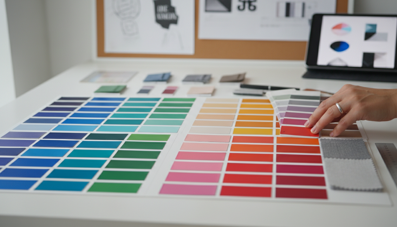
Red is one of the most potent colors in an artist's palette. It can symbolize love, danger, or intensity, depending on its use and context. In paintings, red often draws the eye first, making it a powerful tool for emphasis and focus.
Artists use red to convey strong emotions, whether it's the vibrancy of a sunset, the intensity of a scene, or the warmth of a relationship. This color demands attention and evokes a visceral response in viewers.
Blue: The Calming Influence
Blue, on the other hand, is known for its calming and soothing properties. It's often used in art to create a sense of depth, tranquility, and peace. Many artists choose blue to represent the sky or water, offering a serene backdrop that balances more intense colors.
Incorporating blue into a painting can provide a reprieve from the chaos of other colors, inviting viewers to pause and reflect. This quality makes it a versatile choice for both abstract and realistic works.

Yellow: The Joyful Hue
Yellow is synonymous with joy, optimism, and energy. It can brighten a composition and infuse it with a sense of happiness and warmth. Artists utilize yellow to highlight and accentuate, bringing light to darker scenes.
While too much yellow can be overwhelming, when used thoughtfully, it can uplift a piece and evoke feelings of cheerfulness and hope. This balance showcases the skillful use of color to impact emotional tone.
The Artist's Emotional Palette
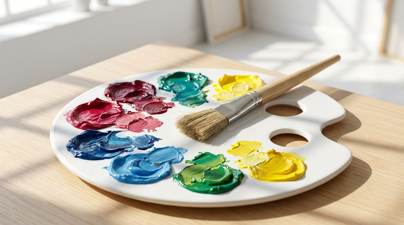
Each artist has a unique relationship with color, often reflected in their choice of palette. Some may gravitate towards bold, contrasting colors to express dynamic emotions, while others prefer softer, harmonious hues for a more subtle impact.
Understanding this personal connection allows us to appreciate the emotional depth in paintings, offering insights into the artist's intentions and feelings. Art becomes a dialogue, where color speaks volumes without uttering a word.
The Viewer’s Experience
The emotional journey of color in painting doesn't end with the artist; it extends to the viewer. Each person brings their own experiences and emotions to a painting, interpreting colors in ways that resonate personally. This interaction creates a unique experience for every viewer.
By exploring the emotional impact of color, both artists and audiences can gain a richer understanding of art. It opens up new ways to engage with and appreciate the visual world, making every encounter with a painting a new emotional journey.