The Story Behind the Colors: Understanding the Emotions in Galerie des Teintes' Paintings


The Power of Color in Art
Colors have always played a significant role in the world of art, acting as a medium of expression and communication. The Galerie des Teintes, renowned for its vibrant and emotive paintings, utilizes color to convey profound emotions and tell compelling stories. Understanding the emotional impact of colors can enhance our appreciation of these masterpieces.
Color theory suggests that each hue evokes specific emotions and reactions. Artists at Galerie des Teintes skillfully harness these emotional cues to create immersive visual experiences. By understanding the psychology behind color, we can better appreciate the depth and intention behind each piece.
Red: Passion and Energy
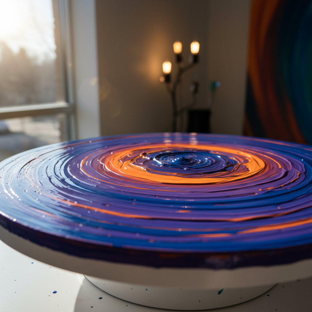
Red is often associated with passion, energy, and intensity. In Galerie des Teintes' paintings, red is used to draw attention and evoke strong emotions. This vibrant hue can be found in pieces depicting love, anger, and determination, offering a visceral connection to the viewer.
For instance, a painting with bold red strokes might convey a sense of urgency or intensity, inviting the audience to explore the underlying narrative. The strategic use of red can transform a simple scene into one filled with dynamic emotion.
Blue: Calmness and Reflection
In contrast to red, blue often symbolizes calmness, introspection, and tranquility. The Galerie des Teintes frequently incorporates shades of blue to create a soothing atmosphere, encouraging viewers to pause and reflect. This color is commonly used in pieces that explore themes of peace and contemplation.
Blue can also evoke a sense of melancholy or longing, depending on its context within the artwork. By blending various shades, artists can convey complex emotions, making blue a versatile and powerful tool in their palette.
Yellow: Joy and Optimism
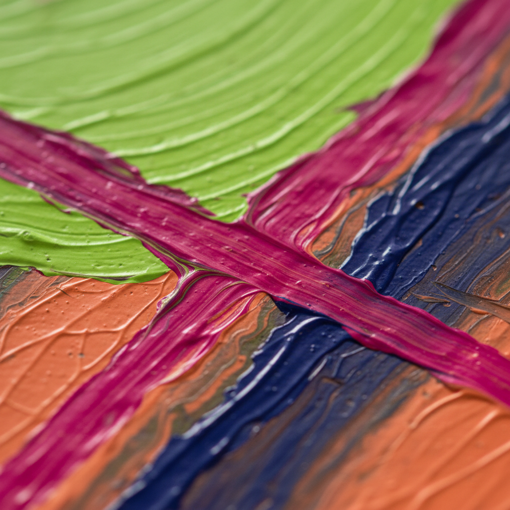
Yellow is synonymous with joy, optimism, and warmth. In the Galerie des Teintes, yellow is often used to highlight moments of happiness and celebration. This bright and cheerful color can uplift the mood of a painting, creating a sense of hope and positivity.
When used in landscapes or portraits, yellow can symbolize the warmth of sunlight or the vibrancy of life. Its presence in a painting often invites viewers to experience a sense of joy and wonder.
Green: Growth and Harmony
Green represents growth, harmony, and renewal. The Galerie des Teintes uses green to illustrate themes of nature, rebirth, and balance. This color can be found in paintings that depict natural landscapes or explore the interconnectedness of life.

By incorporating green, artists can evoke feelings of serenity and equilibrium, inviting the audience to connect with the natural world. This color's calming effect can provide a sense of grounding and stability within the artwork.
The Impact of Color Combinations
While individual colors hold specific meanings, the combination of different hues can create even more nuanced emotional landscapes. Artists at Galerie des Teintes often blend colors to amplify their impact, crafting scenes that resonate on multiple levels.
Understanding these combinations can deepen our appreciation for the artworks, allowing us to see beyond the surface and into the emotional core of each piece. The interplay of colors can transform a painting into a powerful narrative, rich with emotion and meaning.